1. One Idea Per Slide
The single most powerful improvement you can make to any presentation is to enforce a strict "one idea per slide" rule. If a slide needs a heading, three sub-points, a chart, and a callout box to explain itself — it's really two or three slides.
Split it. Your audience can only hold one thought at a time. Giving them multiple competing ideas on a single slide forces them to choose what to pay attention to — and they'll stop listening to you entirely.
2. Use Whitespace Intentionally
Whitespace — the empty space around and between elements — is not wasted space. It is the most powerful design tool you have. Whitespace directs attention, signals importance, and makes content feel premium rather than cluttered.
Leave generous margins on all four sides of your slide (at least 5% of the slide width). Increase the spacing between your heading and body text. Remove any element that isn't earning its place. The resulting breathing room will make your slide look instantly more professional.
3. Choose a 3-Color Palette and Stick to It
A professional color palette has three roles: a background color, a primary text color, and an accent color. Every element in your deck should use one of these three colors — nothing else.
- Background: White, off-white, very dark navy, or charcoal.
- Text: Near-black on light backgrounds; near-white on dark backgrounds.
- Accent: One saturated color used only for headings, highlights, and CTAs.
4. Pick One Hero Font (and One Supporting Font)
Typography is 90% of slide design. Most amateur presentations fail on typography — either too many fonts, fonts that are too small, or fonts with poor readability on-screen.
Use one font for all headings and a second (optionally) for body text. Both should be sans-serif — they render more cleanly on projectors and screens than serif fonts. Calibri, Inter, Montserrat, and Poppins are all excellent choices.
5. Replace Bullet Points with Visuals
Bullet point lists are the default — but they are almost never the best choice. Every time you write a list of bullets, ask: can this be a diagram, an icon grid, a comparison table, or a series of image cards?
Process? Use a flowchart.
Any sequence of steps is clearer as a horizontal or vertical flow diagram than as numbered bullets.
Features? Use an icon grid.
3–6 features displayed as icon + label cards are more scannable and visually appealing than a bulleted list.
Comparison? Use a table.
Side-by-side comparisons are faster to read in a table format than when embedded in paragraph text or bullets.
6. Use the Z-Pattern Layout
Audiences in Western cultures scan visual content in a Z-pattern: top-left → top-right → diagonal down-left → bottom-right. Design your slides with this reading path in mind.
Place your most important element (headline, key number, hero image) in the top-left. Put your call-to-action or key takeaway in the bottom-right. Keep secondary information along the diagonal path. This natural layout guides attention without forcing the audience to hunt.
7. Make Your Most Important Number Very Big
If your slide's main point is a statistic — a growth rate, a user count, a revenue figure — display that number at 80–120pt font size with a descriptive label underneath. This "hero stat" layout is used in every major tech keynote and investor presentation for good reason: it communicates impact immediately.
The audience should be able to read and understand the key takeaway within 3 seconds of the slide appearing — before you've said a word.
8. Use High-Quality Images (and Treat Them Intentionally)
Stock photos pasted onto slides often look generic and trust-eroding. When using images:
- Use full-bleed images (edge to edge) for maximum visual impact on section divider slides.
- Apply a color overlay (semi-transparent fill over the image) in your brand color to unify photos across slides.
- Crop images to reinforce the subject — tight crops on faces or key objects are more powerful than wide generic scenes.
- Avoid clipart and low-resolution images. If it looks blurry at 100% zoom in PowerPoint, it will look blurry when projected.
9. Keep Animations Subtle and Purposeful
Animation is a tool for directing attention — not for entertainment. Every animation should answer the question: "what does this movement help the audience understand?"
- Fade is almost always better than Fly-In, Bounce, or Spin.
- Use appear for progressive disclosure (revealing bullet points one at a time).
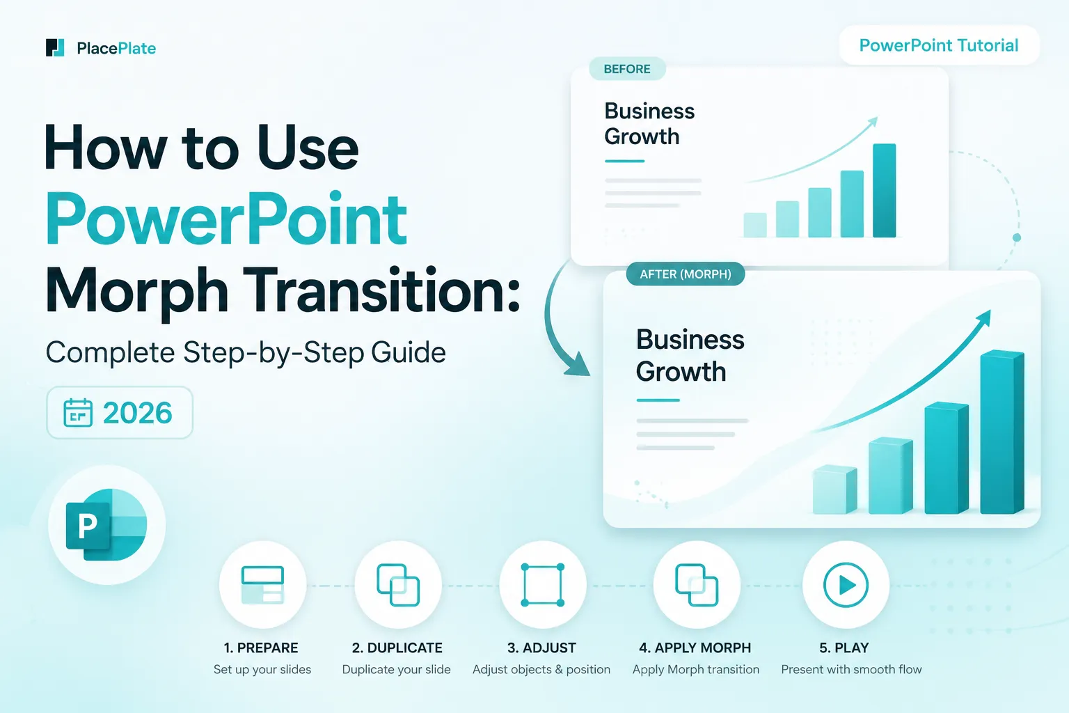
- Use Morph transition (not animation) for smooth, cinematic movement between slides.
- Set duration to 0.3–0.5 seconds for most animations. Longer animations make presentations feel sluggish.
10. Design for the Back Row
Your laptop screen is not your audience's screen. When projected in a conference room or lecture hall, everything appears smaller, lower-contrast, and harder to read than it looks in edit mode. Design with this reality in mind.
- Minimum body text: 20pt (24pt preferred).
- Avoid thin font weights (100, 200, 300) — they disappear on projectors.
- Test your presentation in Slide Show mode at full screen before the real thing.
- Avoid putting critical information in the bottom 10% of the slide — it's often cut off by projector bezels.
Professional Templates, Ready to Use
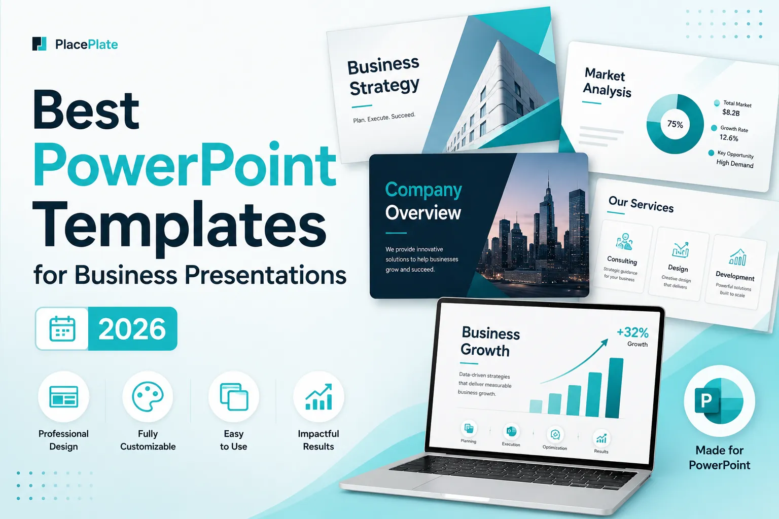
Every PlacePlate template is built with these 10 design principles already applied. Open it, add your content, and present — no design decisions required.